Adding Charts in Quasar
With large datasets, text or tables might not be the ideal way to display data. Charts and graphs are a great way to provide a visual representation of data and illustrate relationships in it.
In this article, I will give you information to help you add charts to your own projects and some of the best practices that you need to follow while creating charts.
There are many Vue Chart libraries available but I find ECharts as the best chart library to use in applications.
Getting Started
Before starting on your visualization journey, you should familiarize yourself with the Quasar, Vue js.
The first thing to do is to install vue-echarts-v3 and echarts using npm.
$npm install --save echarts vue-echarts-v3For Vue 3 (Update)
$ npm install --save echarts vue3-echarts-v3The next thing to do is to import all charts and components.
import IEcharts from 'vue-echarts-v3/src/full.js'For Vue 3 (Update)
import IEcharts from 'vue3-echarts-v3/src/full.js'Now you are ready to create charts. The following example explains how you can use charts in components.
<template>
  <q-page class="q-pa-md bg-grey-2 ">
    <q-card>
      <q-card-section>
        <div class="text-h6 text-grey-8 text-weight-bolder">
          Bar Chart
        </div>
      </q-card-section>
      <q-card-section class="q-pa-none echarts">
        <IEcharts :option="barChartOption" :resizable="true" />
      </q-card-section>
    </q-card>
  </q-page>
</template>
<script>
  import IEcharts from 'vue-echarts-v3/src/full.js';

  export default {
    name: "charts",
    data() {
      return {
        barChartOption: {
          grid:{
            bottom:'25%'
          },
          legend: {},
          tooltip: {},
          dataset: {
            dimensions: ['product', '2015', '2016', '2017'],
            source: [
              {product: 'Matcha Latte', '2015': 43.3, '2016': 85.8, '2017': 93.7},
              {product: 'Milk Tea', '2015': 83.1, '2016': 73.4, '2017': 55.1},
              {product: 'Cheese Cocoa', '2015': 86.4, '2016': 65.2, '2017': 82.5},
              {product: 'Walnut Brownie', '2015': 72.4, '2016': 53.9, '2017': 39.1}
            ]
          },
          xAxis: {type: 'category',
          axisLabel:{
            rotate:45
          }},
          yAxis: {},
          // Declare several bar series, each will be mapped
          // to a column of dataset.source by default.
          series: [
            {type: 'bar'},
            {type: 'bar'},
            {type: 'bar'}
          ]
        },
      }
    },
    components: {
      IEcharts
    },
  }
</script>
<style scoped>
  .echarts {
    width: 400px;
    height: 400px;
  }
</style>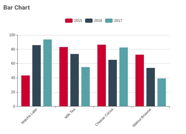
Tips and Tricks for charts
1. Using Computed Method
If you plan to use the chart data from an axios call or change the data on the QSelect then I suggest you to create a computed property that returns chart options. So the advantage of using computed property is that you don't need to make any changes in chart options it will auto reflect the data.
<template>
  <q-page class="q-pa-md bg-grey-2 ">
    <q-card class="bg-white q-ml-sm shadow-11">
  <q-card-section>
    <div class="text-h6 text-grey-8 text-weight-bolder">
      Bar Chart
      <q-select outlined v-model="selected_product"
                class="bg-white float-right q-mb-sm " style="width:300px;"
                :options="product_options" label="Select Product"/>
    </div>
  </q-card-section>
  <q-card-section class="q-pa-none map_height">
    <IEcharts :option="getBarChartOptions" :resizable="true"/>
  </q-card-section>
</q-card>
  </q-page>
</template>
data() {
    return {
        selected_product: 'Matcha Latte',
        data: [
            {product: 'Matcha Latte', '2015': 43.3, '2016': 85.8, '2017': 93.7},
            {product: 'Milk Tea', '2015': 83.1, '2016': 73.4, '2017': 55.1},
            {product: 'Cheese Cocoa', '2015': 86.4, '2016': 65.2, '2017': 82.5},
            {product: 'Walnut Brownie', '2015': 72.4, '2016': 53.9, '2017': 39.1}
        ],
        product_options: ['Matcha Latte', 'Milk Tea', 'Cheese Cocoa', 'Walnut Brownie'],
    }
},
computed: {
getBarChartOptions() {

        let self = this;

        let filtered_data = this.data.filter(function (item) {
            return item['product'] == self.selected_product;
        });

        return {

            grid: {
                bottom: '25%'
            },
            xAxis: {
                type: 'category',
                axisLabel: {},
                nameLocation: "middle",
                nameGap: 78,
            },
            tooltip: {},
            dataset: {
                dimensions: ['product', '2015', '2016', '2017'],
                source: filtered_data
            },buisness
            yAxis: {
                type: 'value',
                splitLine: {
                    show: false
                }
            }, series: [
                {type: 'bar'},
                {type: 'bar'},
                {type: 'bar'}
            ]
        }
    },
}
2. Creating Best Fit line on scatter plot
I have created one function that takes inputs as X and Y axis data and returns the points that you can use to draw best-fit line.
findLineByLeastSquaresMethod(values_x, values_y) {
            var x_sum = 0;
            var y_sum = 0;
            var xy_sum = 0;
            var xx_sum = 0;
            var count = 0;

            /*
             * The above is just for quick access, makes the program faster
             */
            var x = 0;
            var y = 0;
            var values_length = values_x.length;

            if (values_length != values_y.length) {
                throw new Error('The parameters values_x and values_y need to have same size!');
            }

            /*
             * Above and below cover edge cases
             */
            if (values_length === 0) {
                return [[], []];
            }

            /*
             * Calculate the sum for each of the parts necessary.
             */
            for (let i = 0; i < values_length; i++) {
                x = values_x[i];
                y = values_y[i];
                x_sum += x;
                y_sum += y;
                xx_sum += x * x;
                xy_sum += x * y;
                count++;
            }

            /*
             * Calculate m and b for the line equation:
             * y = x * m + b
             */
            var m = (count * xy_sum - x_sum * y_sum) / (count * xx_sum - x_sum * x_sum);
            var b = (y_sum / count) - (m * x_sum) / count;

            /*
             * We then return the x and y data points according to our fit
             */
            var result_values = [];

            x = Math.max(...values_x);
            y = x * m + b;
            result_values.push([x, y]);
            x = Math.min(...values_x);
            y = x * m + b;
            result_values.push([x, y]);


            return result_values
            // };
        }
Example :
<template>
<q-page class="q-pa-md bg-grey-2 ">
<q-card class="bg-white q-mt-sm q-ml-sm shadow-11">
<q-card-section>
<div class="text-h6 text-grey-8 text-weight-bolder">
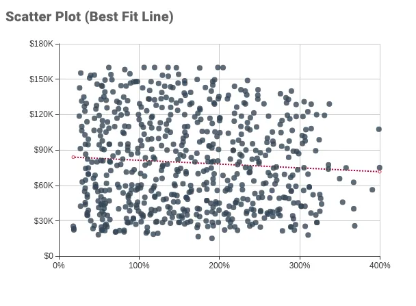
Scatter Plot(Best Fit Line)
</div>
</q-card-section>
<q-card-section class="q-pa-none map_height">
<IEcharts :option="getScatterChartOptionsFitLine" :resizable="true"/>
</q-card-section>
</q-card>
</q-page>
</template>
getScatterChartOptionsFitLine() {
// scatter_data : [ [18.78, 22365], [49.26, 18271], [70.58, 20545], ....... etc.]
let values_x_temp = this.scatter_data.map(function (item) {
return item[0];
});
let values_y_temp = this.scatter_data.map(function (item) {
return item[1];
});
let val = this.findLineByLeastSquaresMethod(values_x_temp, values_y_temp)
let self = this;
return {
title: {text: ""},
tooltip: {
show: true,
trigger: "item",
formatter: function (param) {
return "<span>price-area</span><br />X : " + numeral(param.value[0]).format('0,0') + "% <br />Y : " + numeral(param.value[1]).format('0,0.00');
}
},
xAxis: {
scale: true,
nameLocation: "middle",
nameGap: 37,
axisLabel: {
formatter: function (value) {
return numeral(value).format('0,0') + '%';
}
}
// splitLine:{
// show:false
// }
// splitLine: {show: false}
},
yAxis: {
scale: true,
nameLocation: "middle",
nameGap: 50,
axisLabel: {
formatter: function (param) {
return numeral(param).format('$0a').toUpperCase();
}
}
// splitLine:{
// show:false
// }
},
grid: {left: "15%", bottom: "20%", top: '2%'},
series: [
{
type: "scatter",
data: self.scatter_data,
symbolSize: 8,
itemStyle: {color: "#2f4554"}
},
{
name: "line",
type: "line",
showSymbol: true,
smooth: true,
data: val,
lineStyle: {type: "dotted"},
label: {
show: true,
formatter: "",
textStyle: {align: "right", fontSize: 15},
position: "bottom"
},
silent: true
}
]
}
},
3 Custom Formatter
You can use numeral js for number formatting its very easy. Just create a common method and call it in formatter function.
Installation
npm install numeralExample:
numeral(param).format('$0a').toUpperCase() // For currency format
numeral(val).format('0.00%') // For % format